An agentic AI dashboard for Amazon advertisers — with one hard constraint
The module: a dashboard for performance marketers to analyse brand performance on Amazon — tracking spend, revenue, ROAS, ACOS, CPC across campaign types. AI-generated output would populate the content, making format and length unpredictable by design.
The constraint from the start: no scrolling. Everything had to fit within a single viewport. The structure was defined verbally — what goes where, what each section contains. Design work began from that brief.
Designed to brief. Built as designed.
The initial design followed the specified structure: a data table at top, key impact cards below, analysis and recommendations in the right panel. Performance cards used a half-donut visualisation to show each campaign type's contribution — a reasonable assumption when working with estimated value ranges.
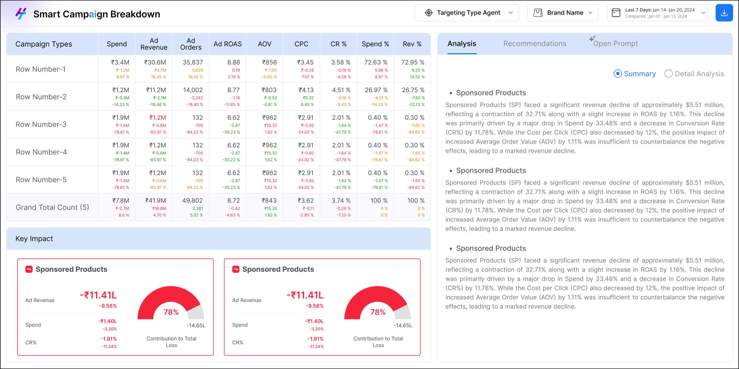
First version — designed to brief, built by dev as specified
The dev build matched the design exactly. What changed the picture was seeing it live — with real data, real values, real people using it.
Real data exposed what dummy data couldn't
Testing happened in daily team meetings — data team, frontend and backend developers, the designer, and the product lead all in the same room. The purpose was to verify data accuracy, check feature behaviour, and surface new requirements.
During one of these sessions, an issue was raised: actual campaign contribution values were exceeding 100%, and the half-donut had no way to represent that. The visualisation broke under real conditions.
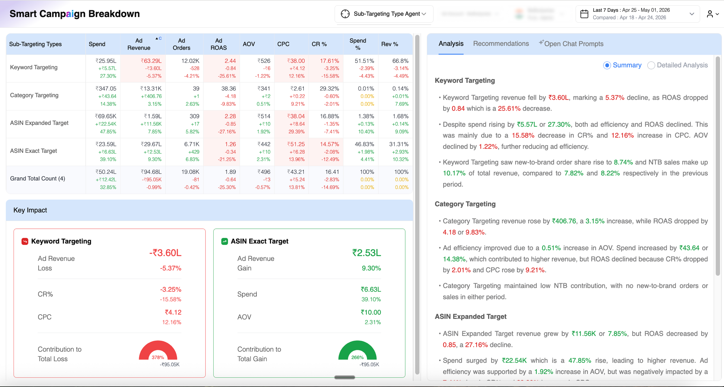
Live build with real data — donut values exceeding 100% made the visualisation factually misleading
The question in the room: fix it or move on — other features were higher priority commercially. The decision was to assign the section for a rethink: not just the chart, but whatever made most sense for that space.
That assignment opened up more than a chart fix. With no prescriptive brief beyond 'do something better here,' the work required understanding what information actually matters to a performance marketer. That meant learning the domain first — and then looking at the rest of the dashboard more critically.
The card issue was one of several
Watching the sessions more carefully — what people looked at, what they reached for, where they slowed down — surfaced a wider set of problems across the whole dashboard.
| Problem | Impact |
|---|---|
| Performance cards using half-donut chart | Values exceeding 100% broke the visualisation — factually misleading |
| Summary / Detail toggle via radio buttons | Switching to Detail reloaded all content, losing the user's place and context |
| Recommendations visually identical to analysis | No clear distinction between an insight and an actionable next step |
| Chat buried as a tab in the right panel | Restricted space made the AI feature nearly unusable — cramped and hard to access |
| Global calendar showing full month grids | Unclear which period was being edited — current or comparison |
Every change traced to a specific problem
The revamp was done independently — domain knowledge built through conversations with the data team, observation of how colleagues used the product, and time spent understanding what each metric actually signals for a performance marketer.
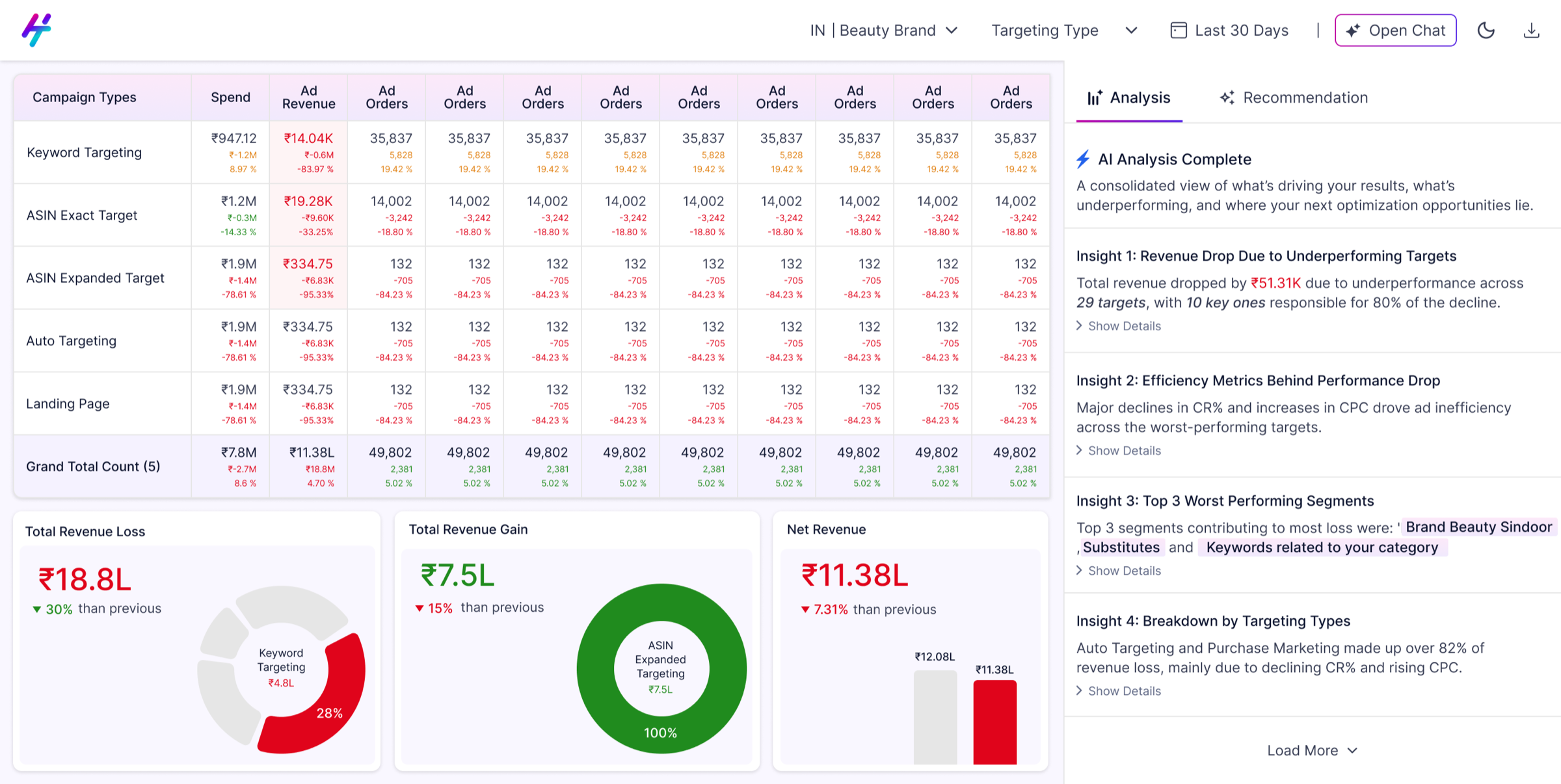
The performance card section wasn't just fixed — it was replaced with more useful information entirely. Two features warranted a closer look beyond the summary table.
Revamped version — full dashboard with all changes applied
From a cramped tab to a proper workspace
In the original design, chat was a third tab inside the right panel — sharing space with Analysis and Recommendations. The sidebar for previous chats ate further into that restricted column. There was barely enough room to read a response, let alone have a conversation with the AI.
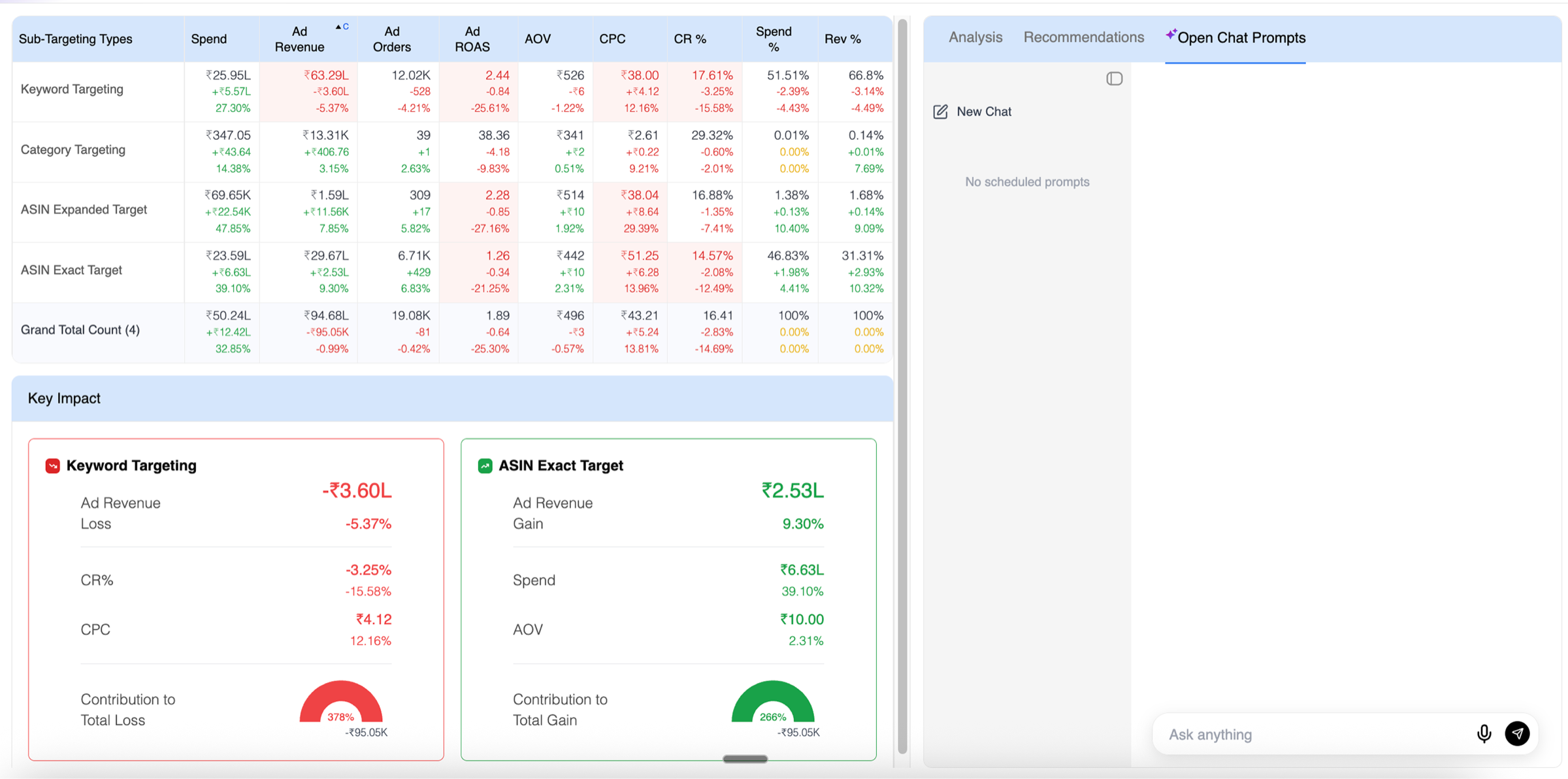
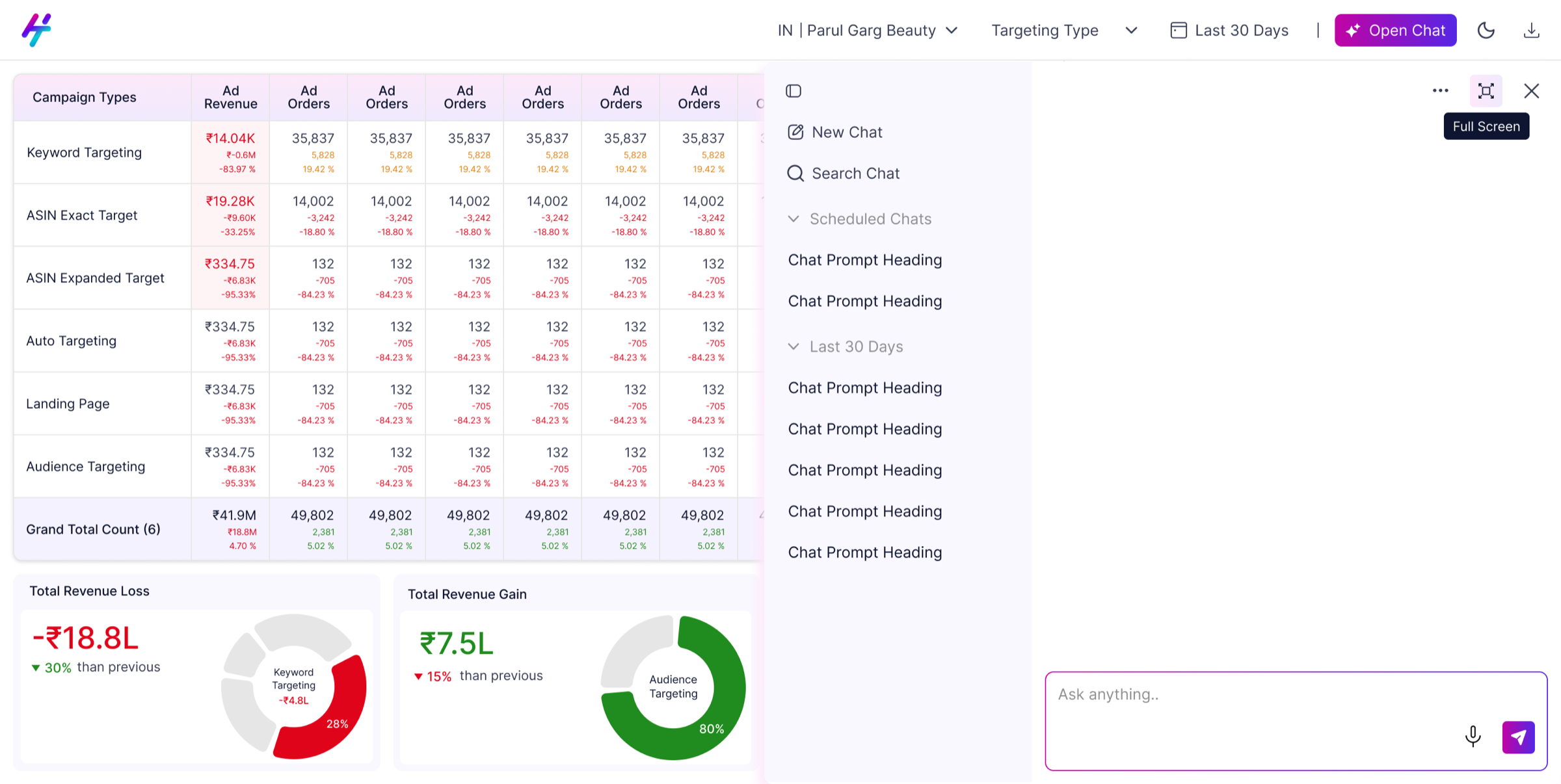
The redesign moves Open Chat to the top navigation bar as a persistent CTA. Clicking it opens a side overlay — previous chats on the left (toggled via the top-left icon), conversation on the right, input at the bottom. A three-dot menu handles additional actions. For users who need full focus, an expand icon takes the panel to full screen. Three states: closed, side panel, full screen — each appropriate for a different level of engagement.
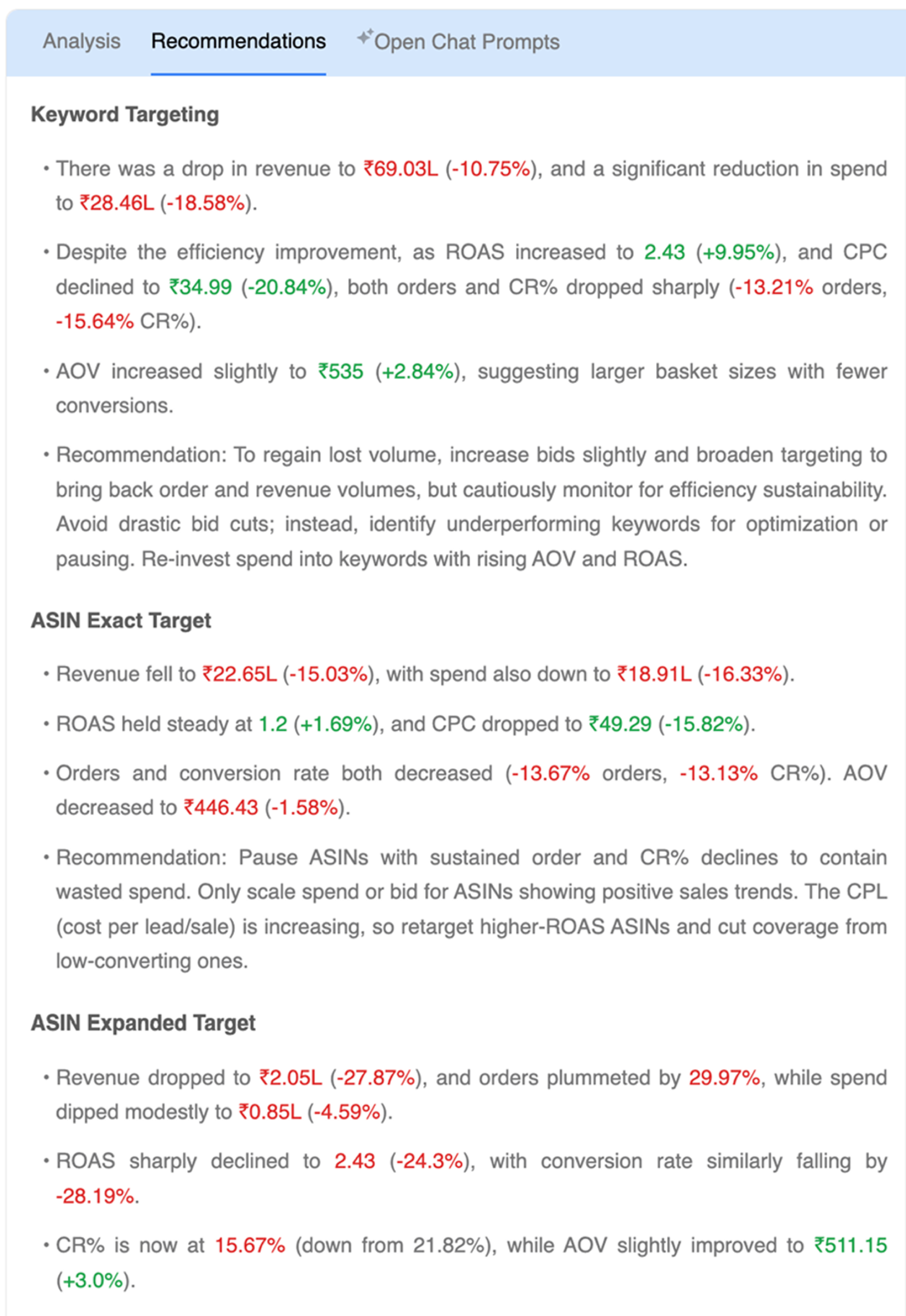
From buried bullet points to scannable actions
In the original build, recommendations were rendered as bullet points inside the same panel as analysis — no visual separation, no hierarchy. The actual recommendation was buried at the bottom of a long block of data, making it easy to miss entirely.
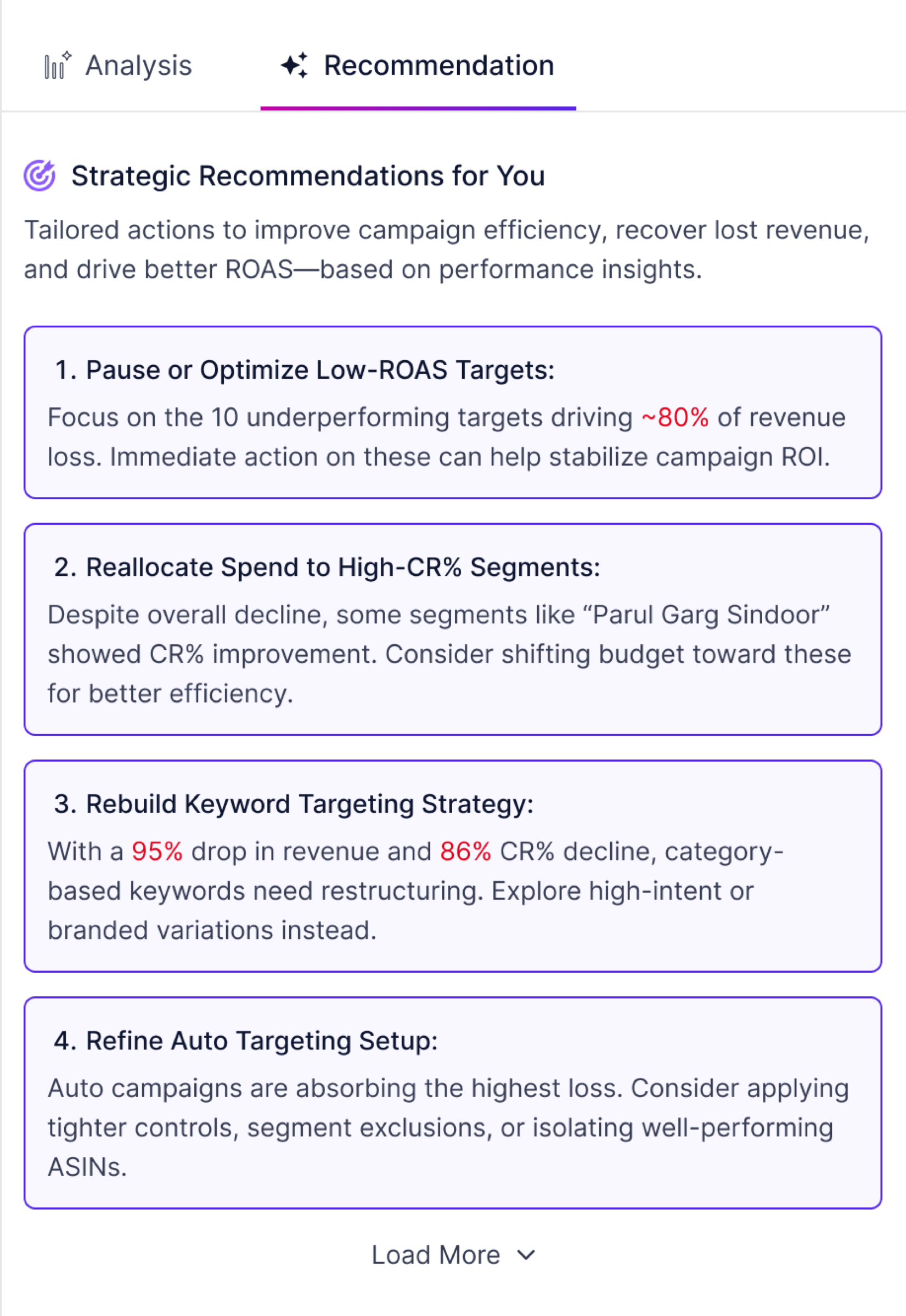
The redesign gives recommendations their own tab with a distinct visual treatment — each action in a numbered card with a bold title and supporting rationale. A Load More option keeps the initial view concise without hiding information, giving users control over how much they want to see.
A smaller problem with its own complete loop
The global date picker was a separate issue — a dual-month full calendar grid where it was unclear whether a selection was changing the current period or the comparison period. Users were making changes without being sure which range they were editing.
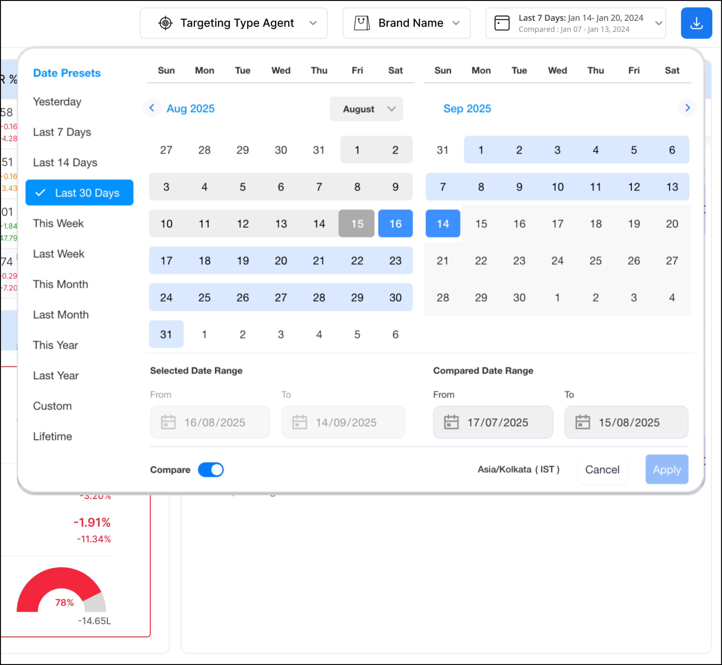
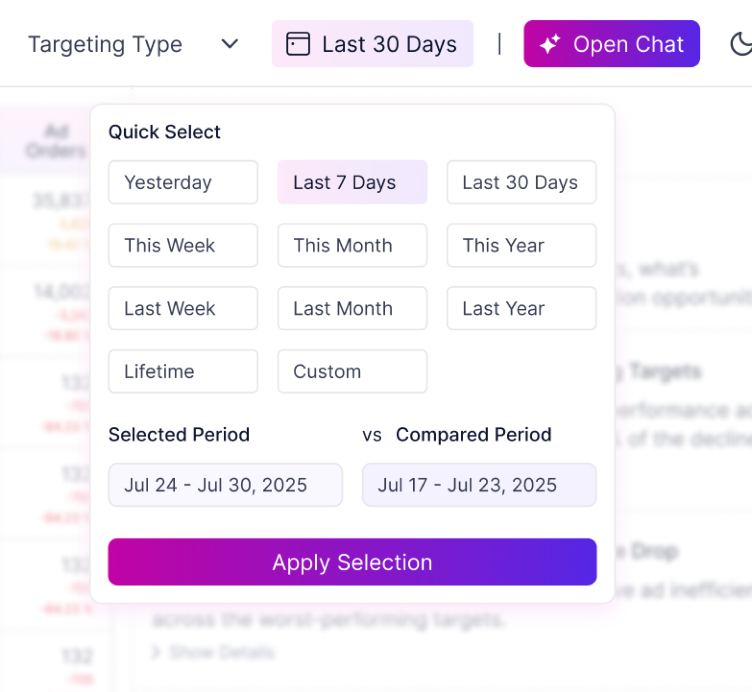
The insight came from sitting with the managed services colleague who uses the calendar daily. Performance marketers think in periods — Yesterday, Last 7 Days, This Month — not specific dates. The redesign leads with quick-select chips for these common cases. Below them, two clearly labelled fields — Selected Period and Compared Period — show the active ranges as readable text. One extra click in exchange for complete clarity.
Validated with the same colleague before being presented. Approved alongside the full dashboard revamp.