A desktop flow adapted for mobile — not designed for it
A mobile signup flow was needed for a live sales context — representatives onboarding clients on the spot, on their phones. The existing flow wasn't built for this. Developers had taken the desktop signup journey and adapted it for smaller screens.
The result: 22 screens to complete a signup. Same inputs, same required information — just stretched across more steps than the task needed, with no visual consistency and no mobile-first thinking applied.
Map the entire flow before touching any design
Before any redesign work began, every screen in the existing flow was documented and laid out in sequence. The goal: understand what was actually there — not just what the flow was supposed to do, but what it asked the user to do at every single step.
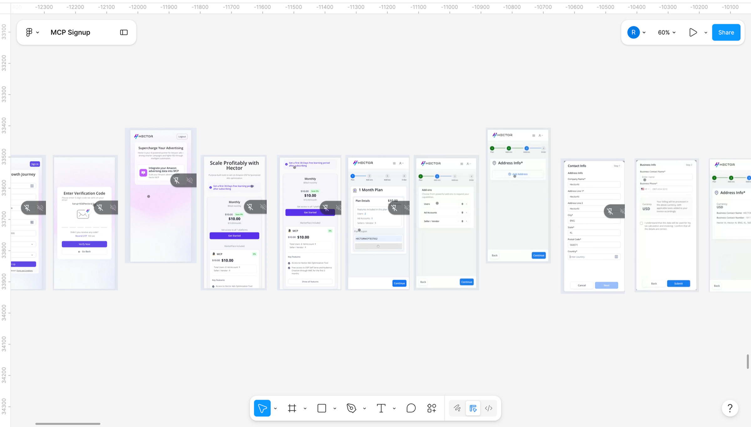
Existing flow mapped in full — screens elevated in the layout were identified as redundant steps
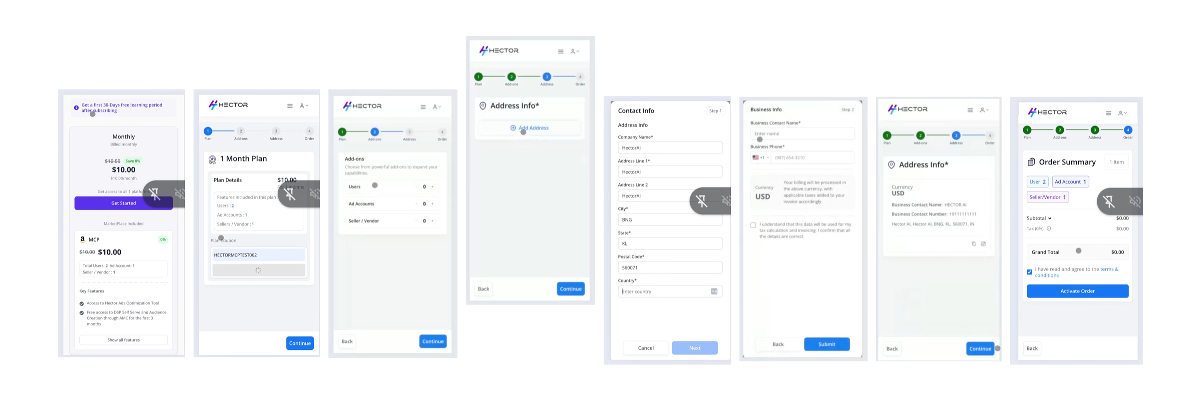
The audit surfaced three categories of problems across the flow.
| Problem | Detail |
|---|---|
| Redundant screens | A screen with a single selectable option — no decision to make. Originally designed for multiple plan types, left in with only one option applicable. The user would click it regardless and move on. |
| Fragmented information | Plan details, user counts, and pricing on separate screens. Information that belonged together — and that users needed to see together — was split across multiple steps. |
| Visual inconsistency | Purple CTAs on some screens, blue on others. No consistent component system. Each screen felt like it came from a different product. |
The clearest example of the core problem
After selecting a plan, the original flow showed a plan confirmation screen, then a separate add-ons screen to adjust user and account counts, then another screen with a single address CTA. Three screens, one decision. Each step asked the user to continue without giving them anything new to act on.
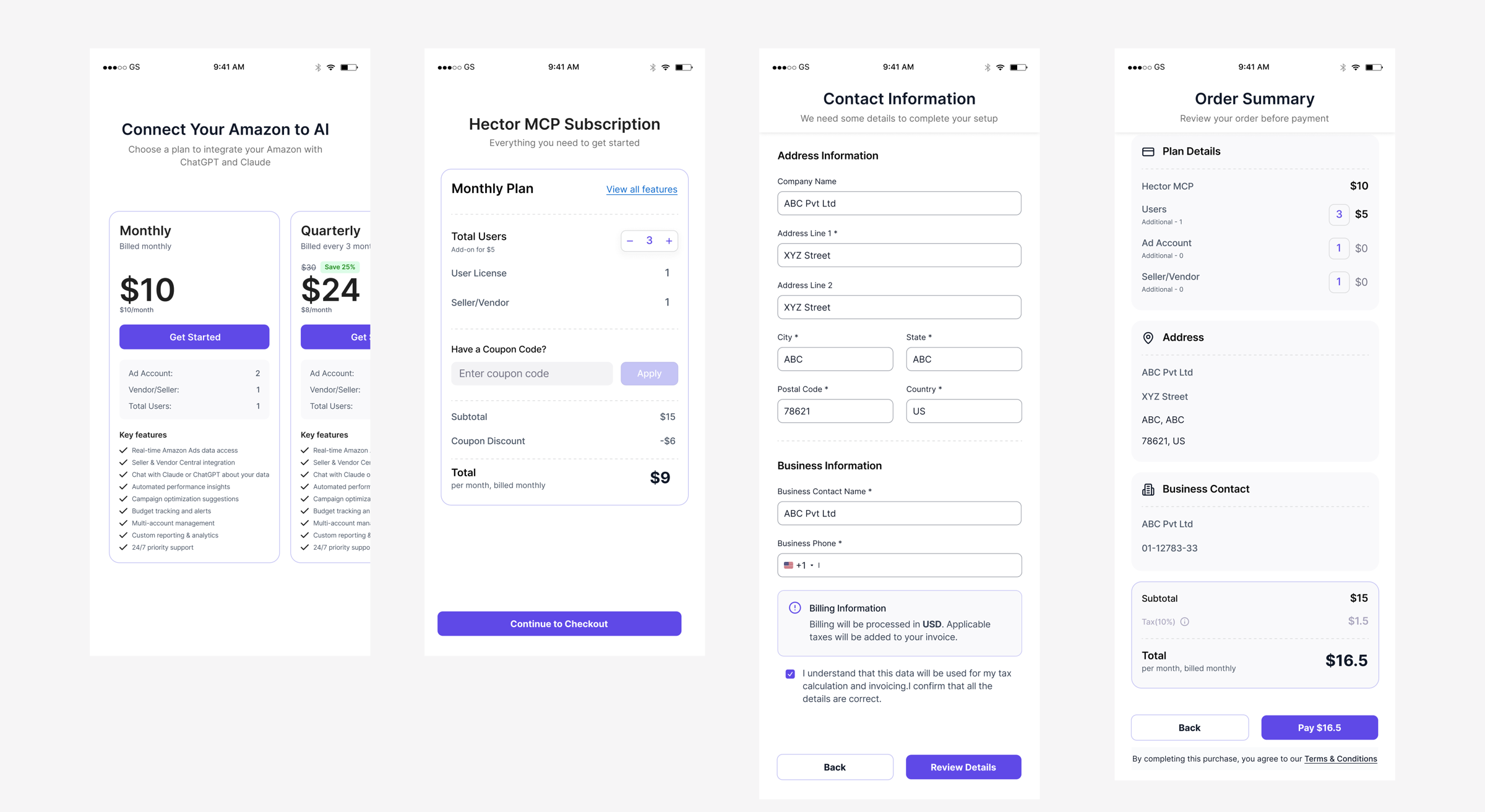
The redesigned screen shows everything at once: selected plan, default account counts with increment/decrement controls, coupon code input, and a live running total. The user sees the full picture and makes adjustments in one place. Minimum steps, maximum control.
The same logic applied across the full flow. Contact and business information consolidated onto one screen. Order summary integrated into the final payment step rather than repeated as a separate screen before it.
13 screens. One visual language. Built for mobile.
The redesigned flow was built mobile-first — not adapted from a larger canvas. A consistent component system throughout: one CTA style, one visual language, no screen that made the user stop and wonder where they were in the process.
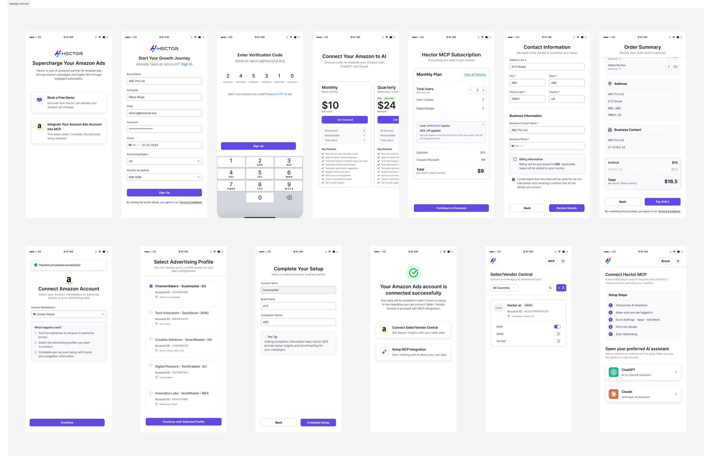
Redesigned flow — 13 screens, consistent UI, mobile-first throughout
Before presenting to the stakeholder, the redesigned flow was shared with the developer to validate technical feasibility. Feedback was limited to implementation effort — no issues raised with the flow logic or structure. The design held.