A 100+ page university website — built faster than its structure could support
SGT University needed a full website revamp — 19 faculties, 100+ pages, covering everything from admissions and programmes to research, examinations, and student life. The existing site had grown organically over time: new faculties added, pages created, sections expanded — without a corresponding update to the underlying structure.
The result was a site that had the right content but the wrong organisation. Pages were missing links. Some sections linked to the wrong destinations. Faculties had inconsistent page structures with no shared template. The navigation didn't reflect what was actually there.
The work began not with design, but with understanding exactly what the site contained — and what it needed to become.
Map what's actually there before deciding what to change
The entire existing site was audited section by section — University, Admissions, Programmes, Research, Examination, IQAC, Footer. Each page was documented, its connections mapped, and its issues annotated: broken links, missing connections, pages that existed but weren't reachable, content that appeared in multiple places without clear ownership.
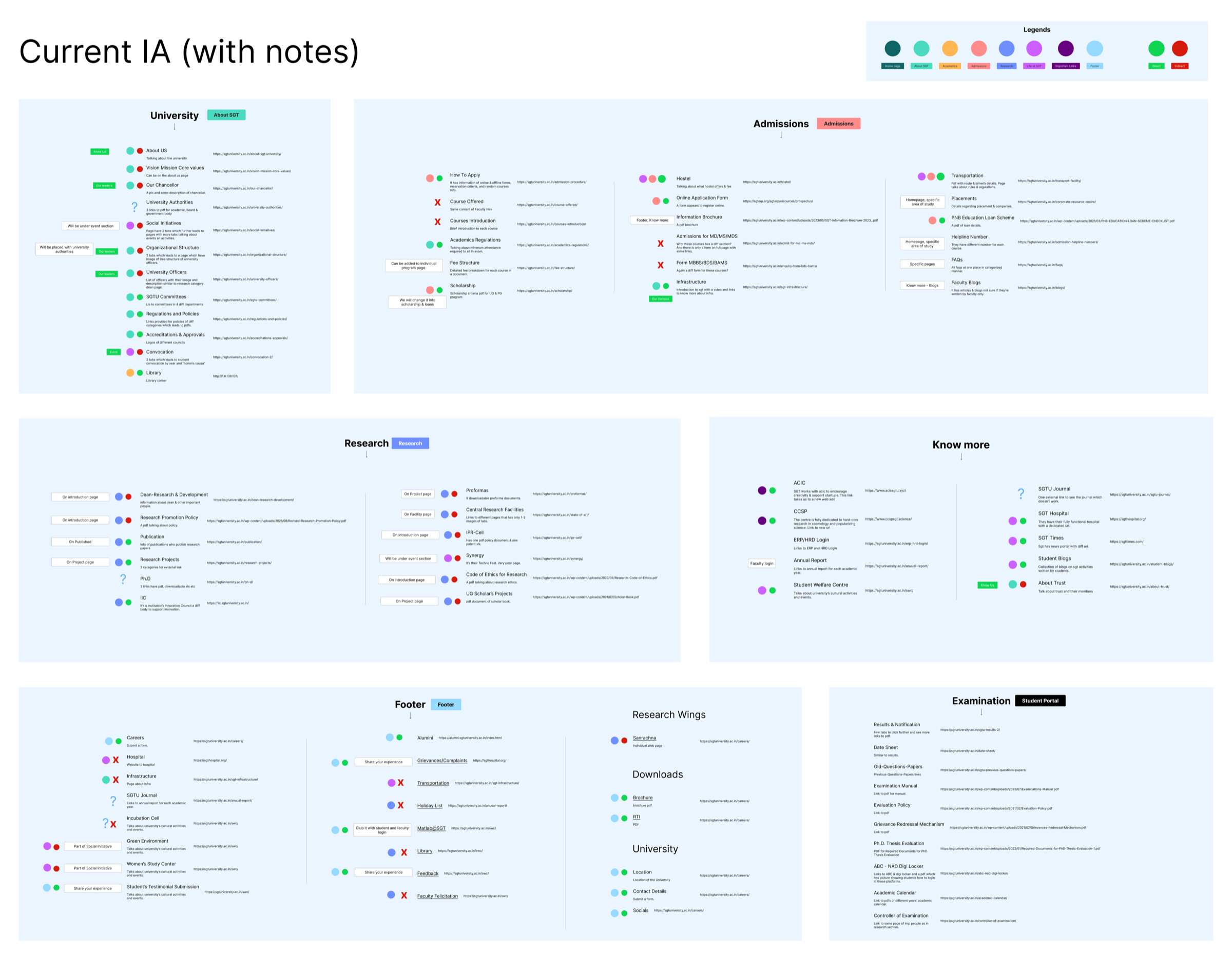
Existing IA audit — color-coded by section, annotated with structural issues across every part of the site
The audit gave a precise picture of the problem — not a general sense that the site is confusing, but a specific map of where it broke down and why. That became the foundation for everything that followed.
A structure the site could actually grow into
The new sitemap reorganised the full site hierarchy — establishing clear primary sections, consistent faculty page templates, and properly connected navigation paths throughout. The goal wasn't to reduce the site but to give every page a logical home and every section a clear relationship to what was above and below it.
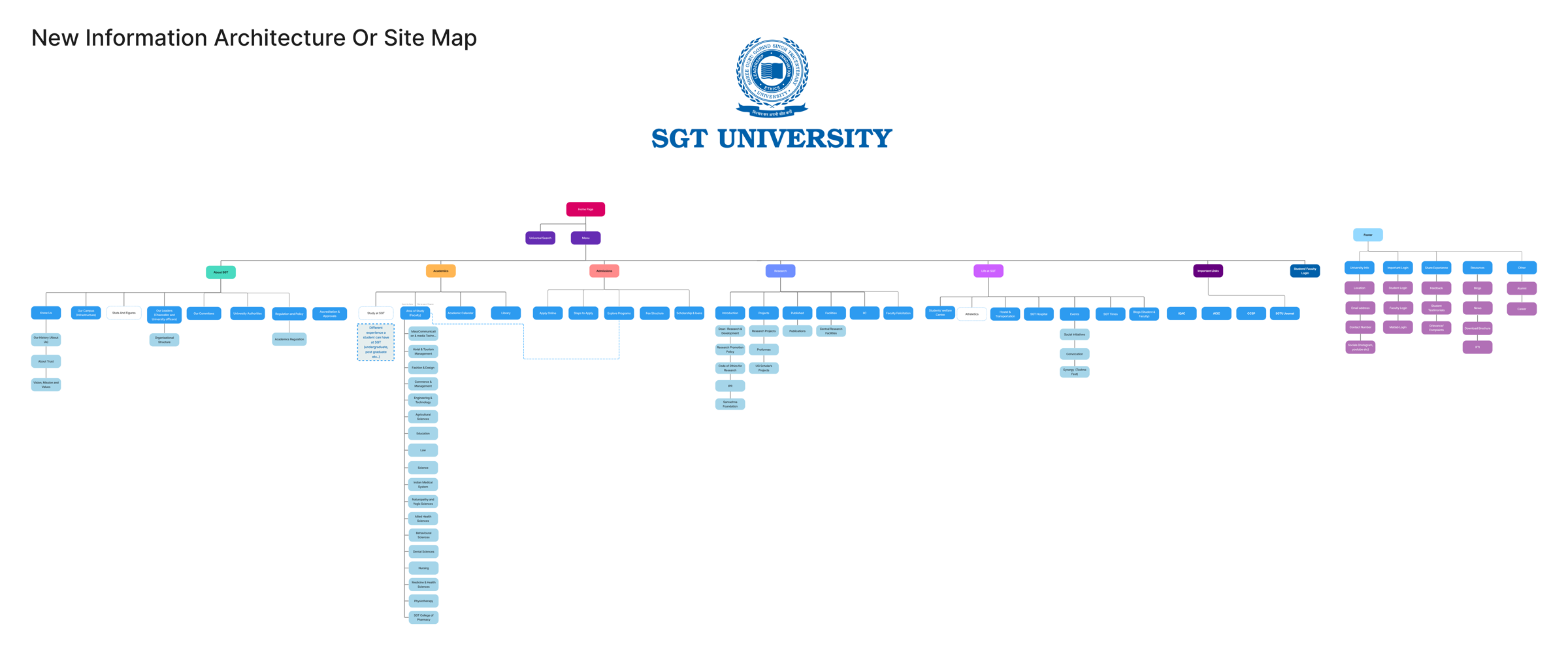
New information architecture — full site hierarchy, color-coded by section, presented to and approved by the client
The new architecture was presented to the client with the audit as its foundation — showing not just what was proposed but why each decision was made. The client aligned on the direction before any layout or visual work began.
From structure to page — defining what goes where
With the architecture agreed, the next step was establishing how each page type would be laid out — what sections appeared, in what order, and how they connected to other pages. Rather than designing one page at a time, the approach was to define templates: a consistent faculty landing page structure that could be applied across all 19 faculties, a programme detail layout, a department listing format.
Allied Health Sciences was used as the working sample — detailed enough to surface every edge case, specific enough to make real layout decisions. The before and after show the structural difference between the existing page organisation and the redesigned layout for the same faculty.
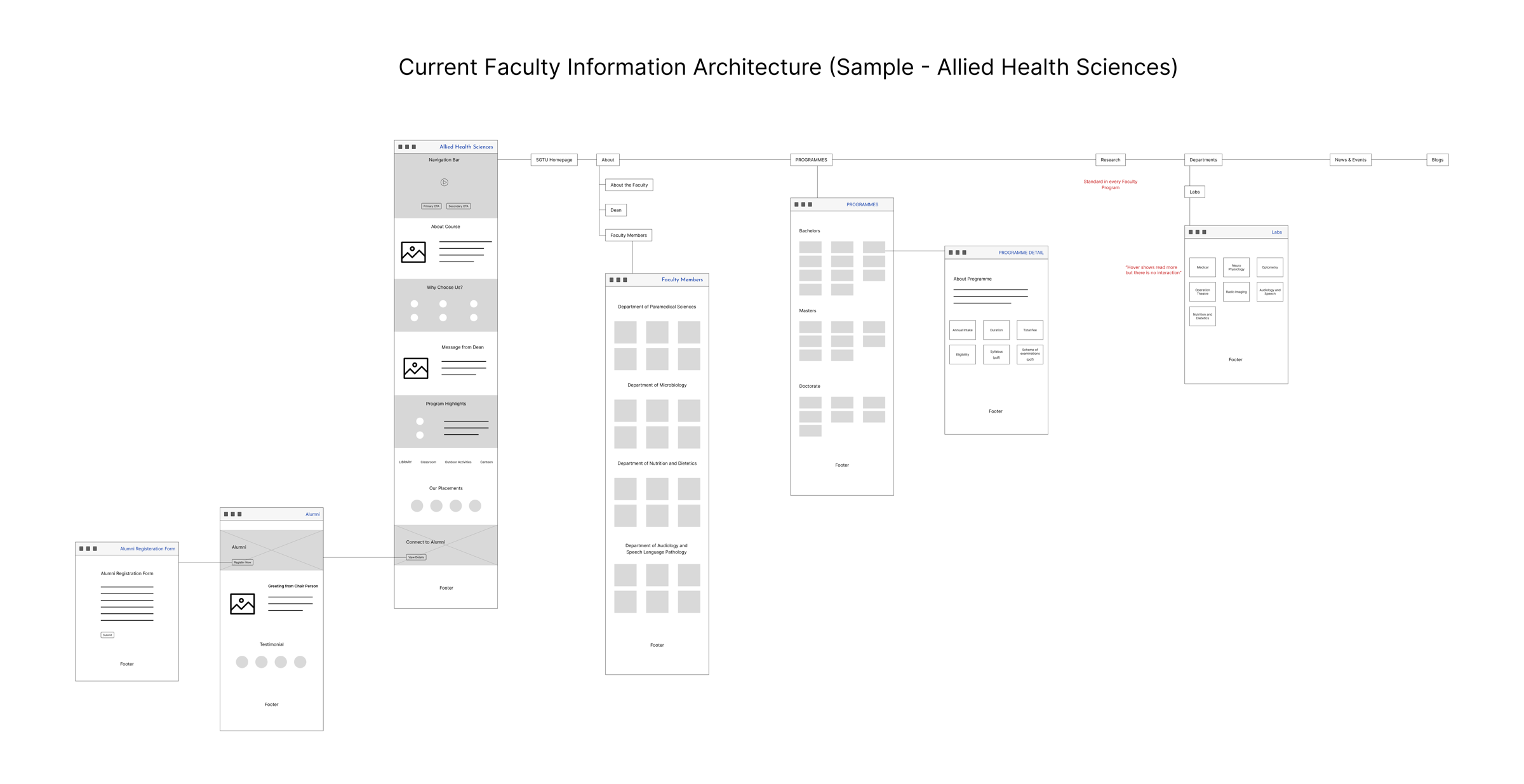
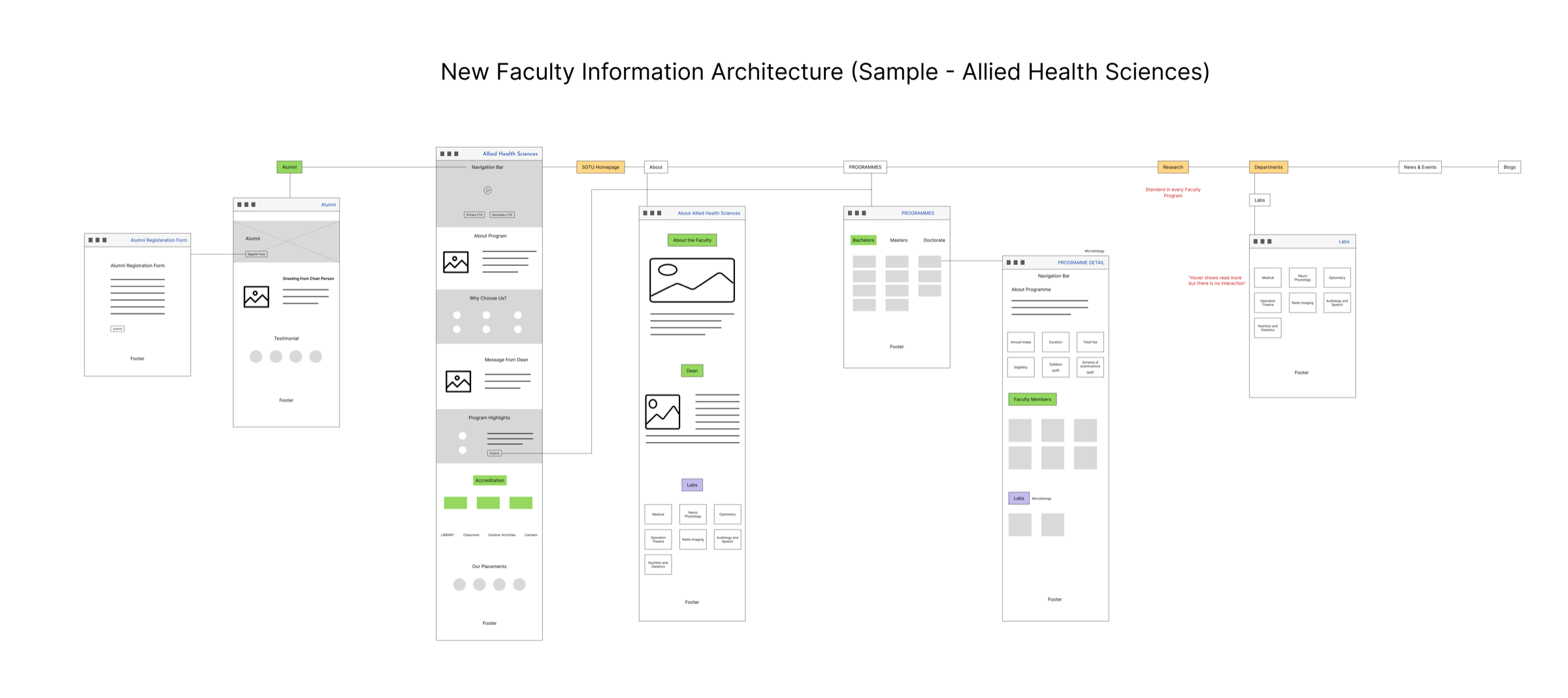
The redesigned layout introduced a consistent section order, properly linked programme details, faculty member listings at the right level, and labs connected where they actually belonged — decisions made once and applied across all faculties.
Four directions. One chosen.
With layout and structure in place, the visual direction work began. The client's existing brand used Montserrat and Open Sans with a blue and grey palette — functional but without a strong visual identity. Four moodboard directions were developed, each grounded in a different interpretation of what SGT University could stand for visually.
 Selected
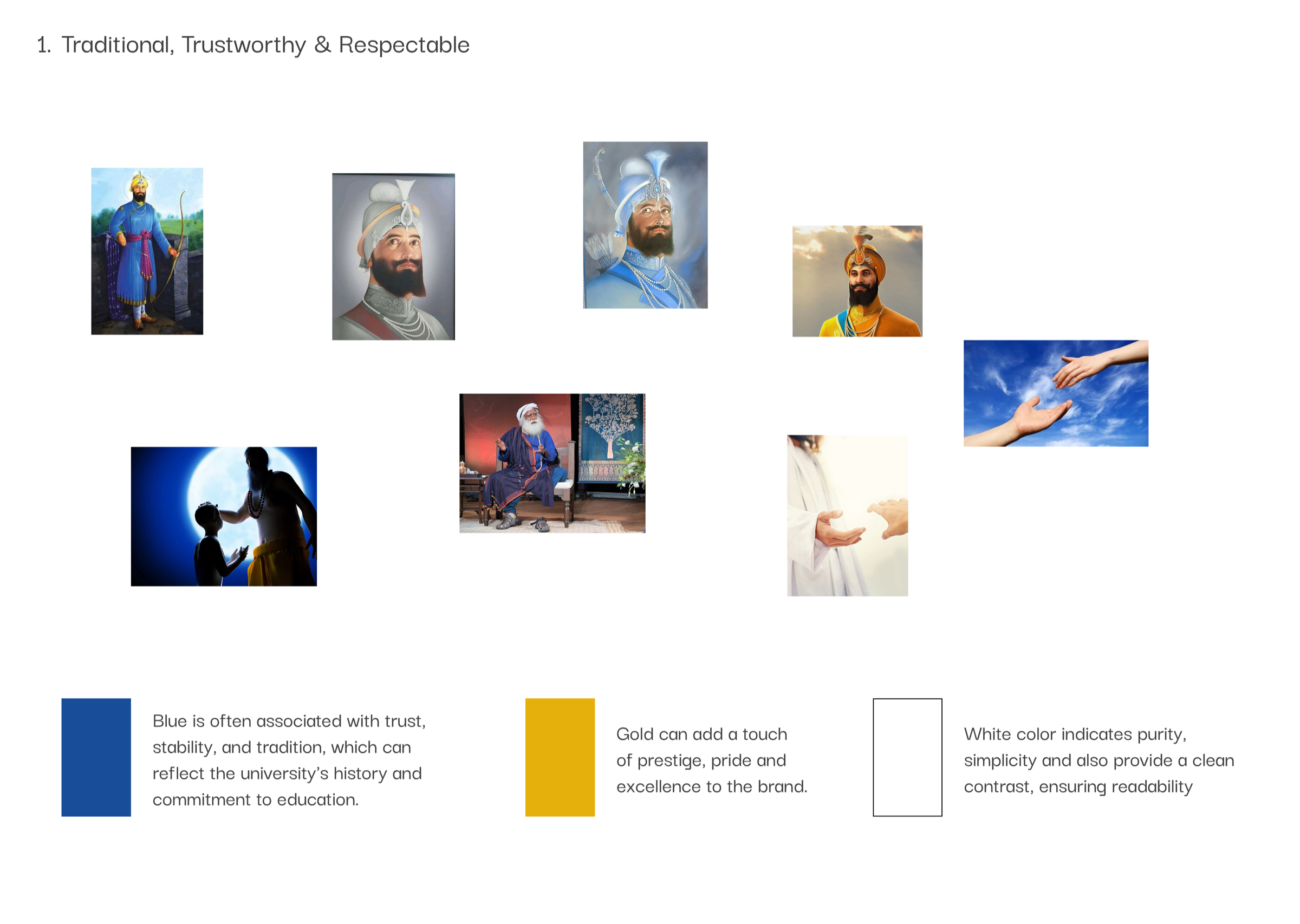
Traditional & Trustworthy
Selected
Traditional & Trustworthy
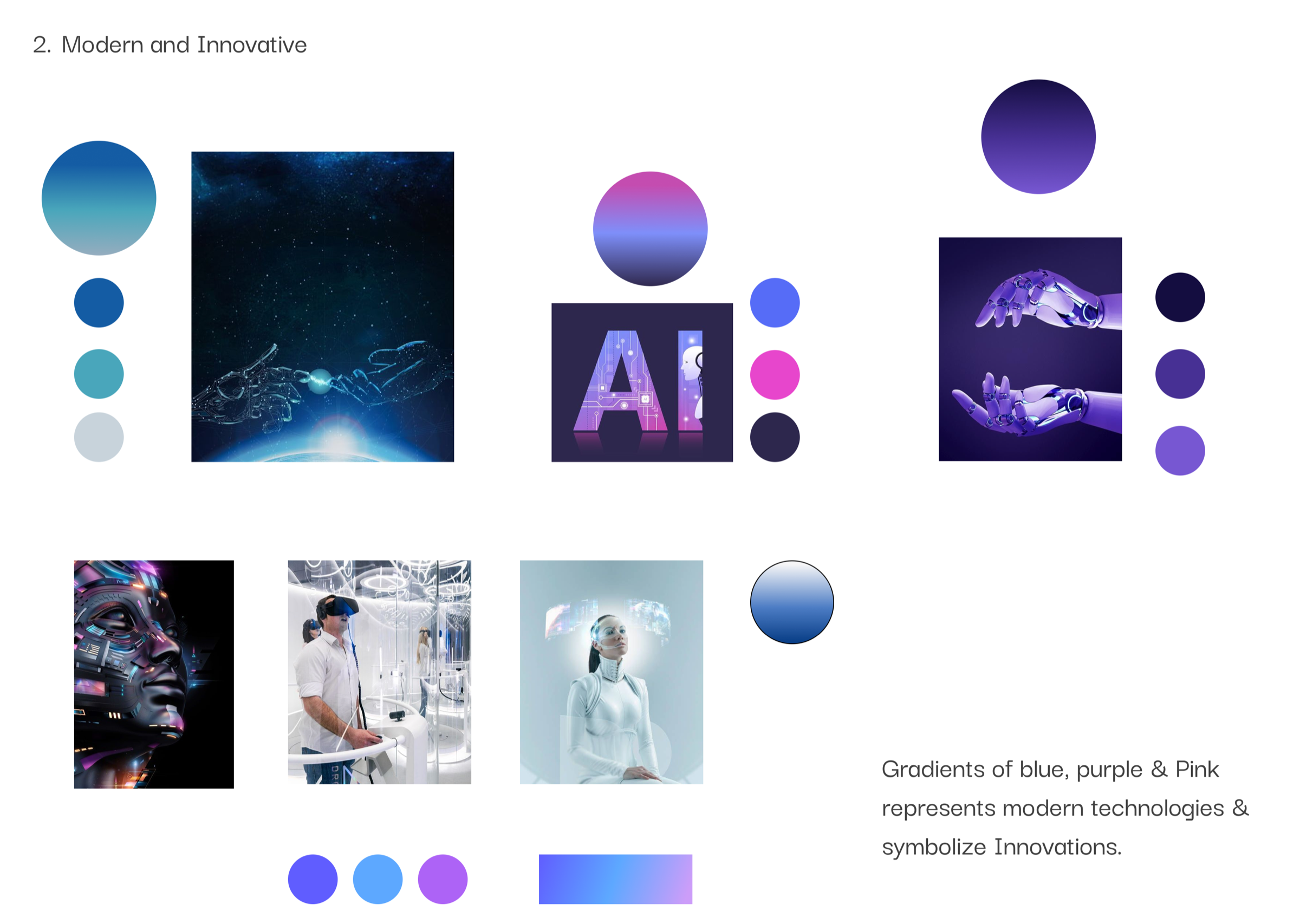 Modern & Innovative
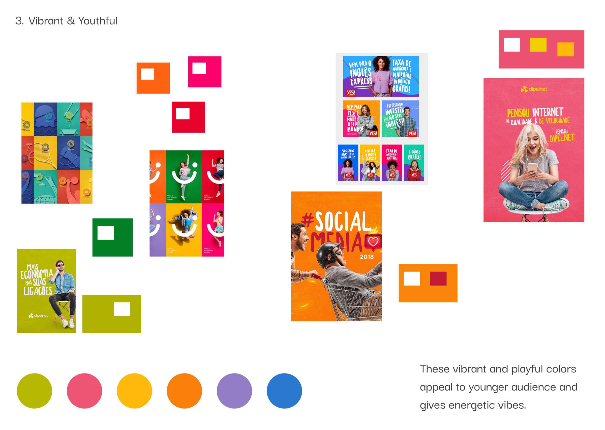 Vibrant & Youthful
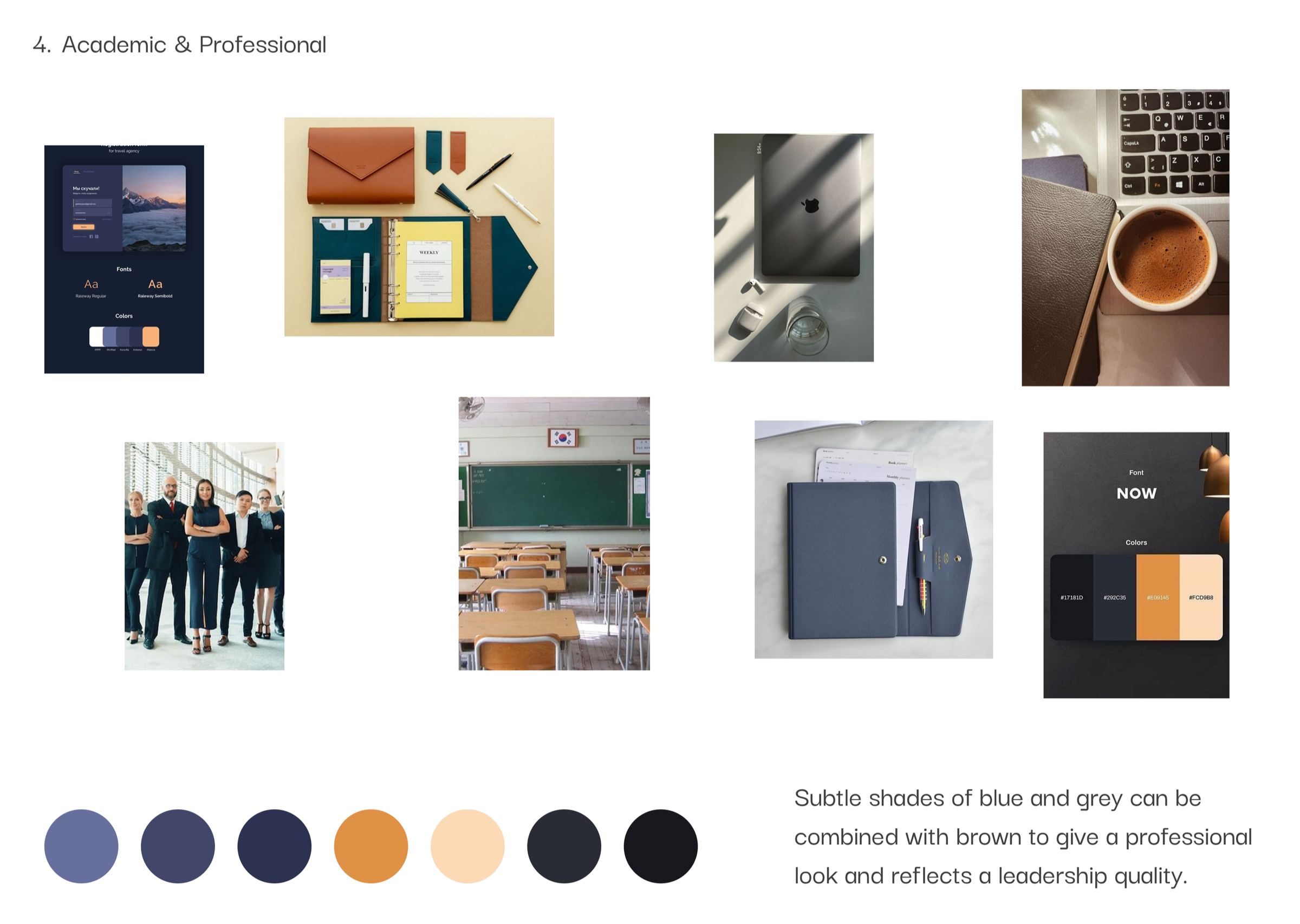 Academic & Professional
The client chose the Traditional & Trustworthy direction — blue for institutional trust and stability, gold as a mark of prestige, white for readability and simplicity. A direction that honoured the university's history while giving it a more refined and consistent visual presence.
Architecture → layout → final UI
The three-panel below shows the full journey for one faculty section: the new IA on the left establishing what pages exist and how they connect, the wireframe in the middle translating that structure into a page layout, and the final UI on the right — the faculty page as shipped, consistent with the visual direction chosen.
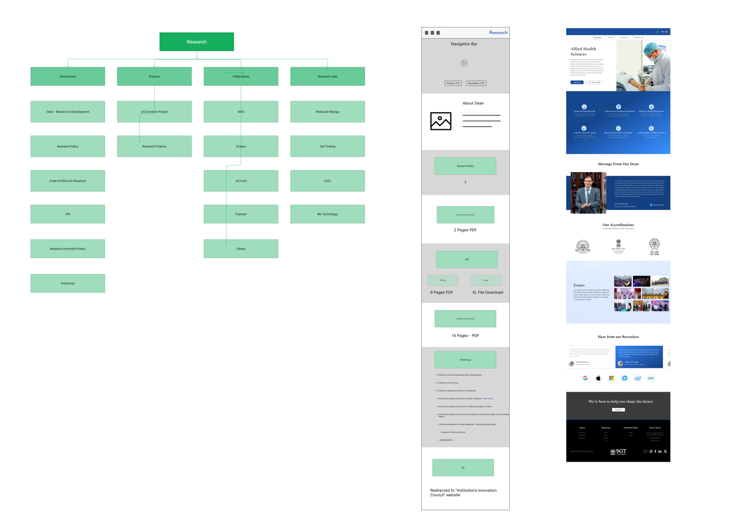
Information architecture, wireframe layout, and final UI in sequence
The same process — structure first, layout second, visual third — was applied across the full site. UI execution was a collaborative effort with one other designer, with UX direction, layout decisions, and design guidelines established and maintained throughout.